Vertical navigation menus are a fundamental feature in web design. These menus, typically located on the left side of a website, provide an organized, easy-to-follow structure that aids in guiding the user through the different sections of the site. They are generally used for sites with multiple levels of content hierarchy, allowing users to navigate through complex information with relative ease. They can work with either icons, text, or a combination of both. The vertical alignment of these menus can be beneficial for those using larger screens, as it allows for the maximization of horizontal space.
However, vertical navigation menus can also be challenging to implement effectively. They require careful planning and consideration in terms of design and functionality. For example, they should not be overly long, causing the user to scroll excessively. Likewise, the menu should not be so compact that it becomes difficult to discern individual items. The text used should be concise yet descriptive, allowing users to quickly identify their desired content. Overall, vertical navigation menus are an essential tool in web design, contributing significantly to the user experience.
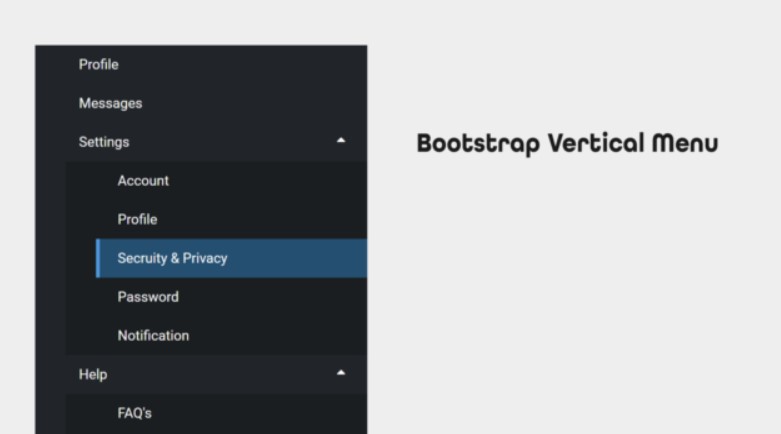
Pros of Vertical Navigation
Vertical navigation offers several benefits that enhance the user experience in web design. Firstly, it provides a clear and simplified path that guides users through the website, thereby reducing confusion and increasing user satisfaction. This design feature is particularly beneficial for websites with vast amounts of content, as it allows the information to be organized in a manner that is easy to navigate. Secondly, vertical navigation is highly flexible and adaptable to various screen sizes.
This is crucial in an era where people access websites through various devices, from desktop computers to smartphones. The vertical arrangement allows for easy scaling, ensuring that the navigation remains user-friendly regardless of the device. Thirdly, vertical navigation is intuitive, aligning with the natural reading patterns of most users, which tend to be from top to bottom and left to right. This enhances the usability of the website, ensuring that users can effortlessly find what they are looking for. Lastly, vertical navigation allows for easy incorporation of branding elements, such as logos and taglines, at the top of the page, thereby enhancing brand visibility. Overall, vertical navigation offers an effective way to improve website usability, adaptability, and brand visibility.
1. Unique Look
Embracing a unique look is a powerful way to express one’s personality and individuality. It is a visual representation of who you are as a person, communicating your preferences, your quirks, and your spirit without uttering a single word. It’s not about following the latest trends or mirroring what celebrities are wearing. It’s about choosing what resonates with your soul, whether it’s eclectic colors, vintage styles, modern minimalism, or a mix of everything.
This distinct style can include clothing, accessories, hairstyles, and even tattoos or body modifications. It’s all about personal comfort and self-expression. People who acknowledge their taste and dare to dress in a way that genuinely reflects their identity often exude a unique aura of confidence and authenticity. The beauty of fashion and personal style is that it’s ever-evolving. As we grow and our tastes change, so can our outward appearance.
This journey of self-expression through appearance can be an empowering experience, and it’s a testament to the diversity and creativity that thrives within us all. By celebrating our unique looks, we not only reinforce our individuality but also contribute to a vibrant, diverse society where everyone has the freedom to be themselves. It’s an integral part of our identity, a silent but eloquent language, a form of self-love, and a testament to the endless variety of human expression.
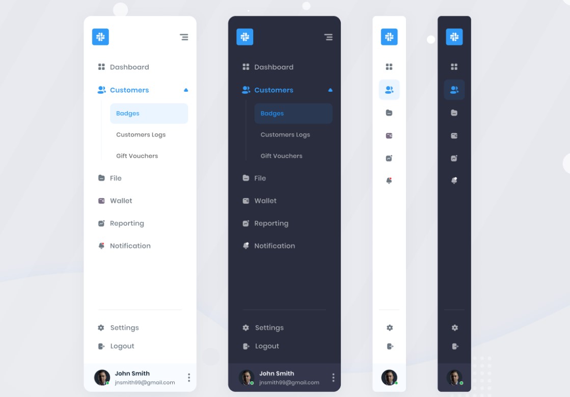
2. Easy to Modify
The concept of being “easy to modify” is a characteristic that is highly sought after in many domains, especially in the field of technology and product design. This refers to the flexibility and adaptability of a system, product or a process to be changed, adjusted or improved with minimal effort or complexity.
The ability of a software, for instance, to allow developers to make changes in its code without disrupting its functionality is an example of it being easy to modify. This characteristic is not limited to just technology or software development. In the world of architecture and interior design, furniture or elements that can be readily altered or reconfigured to meet changing needs and preferences are highly valued. Even in the field of education, curriculums that can be tailored to accommodate different learning styles and paces are seen as advantageous.
The ease of modification can greatly enhance efficiency, user experience, and ultimately, the overall success of a product, system or process. However, it’s vital to strike a perfect balance in this aspect. If a system or a product is too easily modifiable, it may lead to instability or unpredictability. Therefore, while designing or developing anything, one needs to ensure that while it should be adaptable to changes, it should not compromise on its stability or integrity.
3. Name Length Doesn’t Matter
The importance or relevance of a person’s name length is often misconstrued. People tend to believe that a longer name signifies complexity and sophistication, while a shorter name is simple and straightforward. However, this is not necessarily the case. The length of one’s name doesn’t have any bearing on one’s personality, intelligence, or potential. The magnitude of a name does not define or restrict an individual’s capabilities or possibilities. It is the individual who breathes life and meaning into their name, whether it consists of two letters or twenty. A name, long or short, is a label given to us at birth and is a part of our identity.
However, it does not encompass our entirety or determine our destiny. It is our actions, decisions, and character that truly define us and create our legacy. Hence, the importance placed on the length of a name is futile. Whether your name is Alex or Alexander, Mia or Maximiliana, it is you who decides what that name will represent in the world. The perception that the length of a name can influence one’s life path or success is a misguided notion. It is the person behind the name, their perseverance, their courage, their kindness, and their ambition, that truly matters. So, regardless of the number of characters in one’s name, the power and importance of a name come from the individual who carries it.

4. Visible Links
Visible links are an essential aspect of website design that significantly influence user experience and search engine optimization. They function as indicators, guiding website visitors through different pages and content, making navigation easier and more intuitive. An effectively designed visible link is usually underlined or highlighted in a contrasting color to make it stand out from the rest of the text, making it easily recognizable for the user.
When it comes to SEO, visible links play a vital role. They help search engines understand the structure of the website, allowing them to index pages more efficiently. Moreover, they provide a way for users to share specific content, thus increasing the potential for more organic traffic.
One thing to remember, however, is that overuse of visible links can lead to a cluttered and confusing website layout. Therefore, designers should strive for a balanced approach, incorporating only necessary and relevant links. It’s also crucial to ensure that these links are functioning properly, as broken links can negatively impact both user experience and search engine ranking.
In the realm of accessibility, visible links are also paramount. For users with visual impairments, for example, having links that stand out from the rest of the text can make a significant difference in their ability to navigate the website.
In conclusion, visible links are a critical element in the digital landscape, contributing to user experience, SEO, and accessibility. When executed correctly, they can enhance a website’s usability, improve its visibility on search engines, and make it more accessible to all users.
5. Screen Size Irrelevant
In the digital age, the importance of screen size has diminished significantly. The evolution of software and hardware technologies has made the screen size largely irrelevant. Whether it’s a smartphone, tablet, laptop, or a large screen desktop, the content adapts seamlessly to the screen size. This is due to the advent of responsive design, which allows websites and applications to automatically adjust their layout, images, and functionalities to suit the specific dimensions of the device they are being viewed on. Therefore, whether you are reading an e-book, browsing a website, playing a game, or watching a video, the experience remains consistent across varying screen sizes.
This is a major shift from the past when the user experience was significantly affected by the size of the screen. In the current scenario, manufacturers and developers are more focused on enhancing the quality of the display, improving resolution, and optimizing the user interface for a more immersive and interactive experience. In fact, the user’s preference for a particular device is more influenced by factors such as portability, battery life, processing power, and other features, rather than the size of the screen. Consequently, the screen size has become an obsolete factor in the user’s digital experience.

Cons of Vertical Navigation
Vertical navigation, while being an efficient space saver and providing a clear, organized layout, does have several drawbacks that can hinder the overall user experience. First and foremost, it can limit scalability. As the volume of content increases, vertical navigation menus can become overly long, thus making it challenging for users to locate specific information quickly. Moreover, the visibility of certain options may be reduced if the navigation menu has to be scrolled, potentially leading to frustration for users.
Another disadvantage is that vertical navigation can prove to be less intuitive for certain users, especially those accustomed to traditional horizontal navigation. This can lead to confusion and increase the time taken to navigate the website or application. In addition, it might create an imbalance in the layout of the page, leaving too much white space on one side, which can be aesthetically unappealing.
Furthermore, vertical navigation can potentially lead to a less optimized mobile experience. With the increasing trend towards mobile browsing, this becomes a pertinent issue. Vertical navigation menus often need to be collapsed or hidden on smaller screens, which can add an extra step for users and make navigation less efficient.
Finally, vertical navigation may pose challenges for accessibility. Certain assistive technologies may struggle with this format, making it harder for users with disabilities to navigate the website or application. Hence, while vertical navigation can offer certain benefits, these disadvantages should be carefully considered to ensure that the user experience is not compromised.
1. Navigation Challenges
Navigation, as an activity that involves movement from one place to another, presents several challenges. The geography of the area, weather conditions, and the accuracy of the navigating equipment used all contribute to the potential difficulties. Unpredictable weather can make navigating tricky, especially in the case of sea or air travel where fog, storms, or other adverse conditions can obscure visibility and make it difficult to follow the intended course. In terms of geography, the presence of mountains, rivers, or other natural barriers can also complicate navigation, forcing detours that may not have been included in the initial route planning. Urban areas present their own unique challenges with their complex network of roads, intersections, and traffic conditions.
The accuracy of navigation equipment is another crucial factor. For instance, GPS systems, while widely used and generally reliable, can sometimes provide inaccurate information due to signal interference or outdated maps. This can result in the user being led off course or even into potentially dangerous situations. Additionally, the reliability of compasses and other traditional navigation tools can be affected by various factors such as magnetic fields or mechanical issues.
In the modern world, where efficient and safe travel is often taken for granted, the challenges of navigation remind us of the complexities involved in moving from one location to another. These challenges also highlight the importance of developing more advanced and reliable navigation tools and techniques to ensure safe and efficient travel. Whether on land, at sea, or in the air, navigation remains an essential aspect of our daily lives, an activity filled with both challenges and opportunities.

2. Space Consumption
Space consumption refers to the use or allocation of space, whether it’s in the context of urban development, home design, or even the digital sphere. In the realm of urban planning, this term often indicates how buildings, structures, and infrastructures are arranged, occupying physical space in cities and towns. The efficiency of space consumption in this context contributes significantly to the liveability and sustainability of urban environments. On a smaller scale, within the home or office, space consumption may refer to how furniture and items are arranged to maximize utility and comfort.
In the digital world, space consumption revolves around how much storage or memory a particular file or application requires. The management of digital space is crucial to ensure smooth operation of devices and systems. Internet companies, for instance, invest heavily in data centers to accommodate the enormous volume of data generated and utilized daily.
Space consumption also touches upon environmental concerns. The overconsumption of space, especially in terms of land use, can lead to detrimental effects on the environment, such as habitat destruction and increased carbon footprint. This calls for a more mindful and sustainable approach to consuming space, incorporating elements like green design and compact city planning. Mitigating the impact of space consumption is an important aspect of addressing broader issues such as climate change and biodiversity loss. Hence, understanding and managing space consumption effectively is a multifaceted challenge that spans from our individual households to the global community.
3. Aged Appearance
An aged appearance is often viewed as a sign of wisdom, experience, and maturity. It is a natural part of life that everyone will experience at some point. It is typically characterized by wrinkles, gray or thinning hair, and other physical changes. However, the perception of an aged appearance varies greatly across different cultures and societies. In some cultures, it is respected and revered, while in others it is often stigmatized and associated with loss of vitality.
Despite this, an aged appearance does not necessarily reflect one’s physical capability or mental sharpness. Many individuals continue to lead active, fulfilling lives well into old age. Ageing is a complex process influenced by various factors including genetics, lifestyle choices, and environmental conditions. It is common for people to try and slow the process of ageing through various methods, such as maintaining a healthy diet, engaging in regular physical activity, and using skincare products designed to minimize signs of ageing. Others may opt for more invasive procedures like plastic surgery to alter their aged appearance.
Regardless of the methods used, it is important to remember that ageing is a natural process that everyone will experience and that an individual’s value and worth extend far beyond their physical appearance. It is also worth noting that an aged appearance can carry a certain beauty and grace of its own, reflecting a lifetime of experiences, wisdom, and resilience.
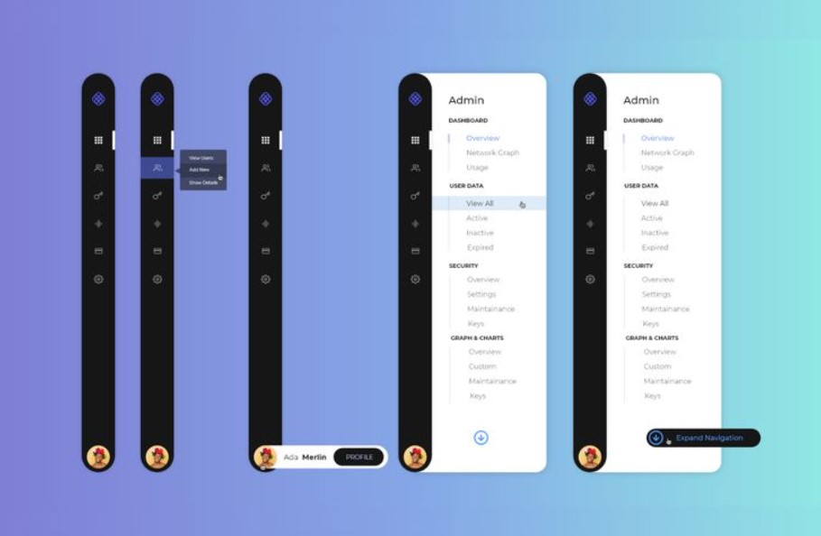
Vertical Navigation Myths
Vertical navigation is a web design technique used to organize content in a website or application. Despite its widespread use, several misconceptions surround this design approach. One common myth is that vertical navigation limits the creativity of the web designer. However, it is important to remember that creativity isn’t just about reinventing the wheel, but also about using established structures in unique and effective ways. The vertical layout presents an opportunity for designers to experiment with different aesthetic elements, such as colors, fonts, and icons, to enhance user experience.
Another prevalent fallacy is that vertical navigation is outdated. This misconception stems from the fact that this design technique was used extensively in the early days of web design. However, the truth is that vertical navigation has evolved over the years and remains a relevant and effective design strategy. It’s particularly useful for mobile designs where horizontal space is limited.
The idea that vertical navigation is confusing for users is another myth. The reality is that this design technique can enhance the user experience if implemented correctly. It allows for a more natural reading and scanning flow, following the ‘F’ pattern that eyes naturally take when reading content. This makes it easier for users to find what they are looking for without having to hunt around the page.
Finally, there’s a misconception that vertical navigation results in slower website load times. However, the speed of a website depends on various factors such as the server’s performance, the amount of content on the page, and the efficiency of the code, among others. Therefore, blaming vertical navigation alone for slow website speed is a simplistic view that ignores the complexity of web performance.
In conclusion, while vertical navigation does have its challenges, many of the myths surrounding it are unfounded. By understanding these misconceptions, designers can make more informed decisions and create more effective and user-friendly designs.
Using Vertical Navigation Effectively
Vertical navigation refers to the arrangement of website menu items in an up-and-down display, typically located on the left or right side of a web page. It is an efficient tool for structuring your website content and plays a critical role in the user’s experience. Effectively utilizing vertical navigation can significantly enhance the functionality and aesthetic appeal of your site, contributing to a better user experience and higher customer retention.
To use vertical navigation effectively, it is essential to understand the site’s content and the user’s needs. Prioritize the most critical items that the users are likely to interact with and arrange them in a hierarchy. Always place the most relevant or frequently used items at the top of the list, followed by less crucial items. This creates a user-friendly environment that can significantly enhance user satisfaction and engagement.
Additionally, keep the menu concise and straightforward. Too many items can overwhelm the user and make the site difficult to navigate. If you have multiple items, consider using drop-down menus or accordion menus that expand when clicked. This allows you to include more items without cluttering the page, thereby maintaining a clean and streamlined appearance.
Lastly, it’s crucial to maintain consistency in design and functionality across all pages. The vertical navigation should look and operate the same way on every page to avoid confusing the user. Use clear, easy-to-understand labels for each menu item and ensure they are clickable and responsive. This will make your website intuitive to navigate, which can increase user satisfaction and lead to higher conversion rates.
In conclusion, vertical navigation is a valuable tool for organizing website content and enhancing user experience. By understanding your content and user needs, keeping the menu simple and straightforward, and maintaining consistent design and functionality, you can use vertical navigation effectively to boost user satisfaction and engagement.

1. Left-side Placement
Left-side placement refers to the strategic positioning of objects, information, or elements on the left side in a particular arrangement or design. This concept is commonly utilized in various fields such as graphic design, advertising, and even traffic systems. The reasoning behind this is primarily based on the reading and viewing habits of most individuals.
Since a significant segment of the global population reads and interprets information from left to right, placing essential elements on the left side ensures they are noticed and processed first. This is particularly useful in advertising, where key messages or engaging visuals are placed on the left to capture viewer attention instantly. Similarly, in graphic design, the left side is often where logos or crucial information are placed to ensure visibility. Traffic systems in certain countries also use left-side placement, with vehicles driving on the left side of the road.
This arrangement is due to various historical and pragmatic reasons, including the dominant right-handedness in humans. However, it’s crucial to note that left-side placement is not universally adopted. Some cultures read from right to left, leading to a preference for right-side placement in those contexts. Therefore, understanding the audience’s viewing habits and cultural background is crucial when deciding on the use of left-side placement.
2. Distinctive Design
Distinctive design is a unique and creative approach to aesthetics that sets a product, building, or graphic apart from its peers. It’s a blend of functionality and aesthetics, where form and function intertwine in a harmonious dance. This is often the result of a designer’s comprehensive understanding of the product’s use and the end user’s needs. It often challenges the norm, pushing boundaries and encouraging new ways of thinking.
This approach can be seen in a variety of fields, from architecture and graphic design to product design and fashion. Key to a distinctive design is its uniqueness and the ability to capture the attention of its intended audience. For example, in the world of fashion, a distinctive design could be a garment that combines unconventional materials or shapes. In the realm of architecture, a distinctive design might incorporate unusual structures or features that defy traditional norms.
The goal is to create something that is not only aesthetically pleasing but also functional and efficient. In the end, a distinctive design is a testament to the designer’s creativity, skill, and dedication to their craft. It serves as a visual representation of their unique perspective and innovative approach to design. This not only sets the product apart but also enhances the user’s experience, making it memorable and impactful.

3. Keep it Simple
The mantra “keep it simple” is an age-old adage that continues to hold relevance in our complex world. It is applicable across all spheres of life, including but not limited to, communication, design, problem-solving, and decision-making. The premise of this approach is to strip away the unnecessary complexities and focus on the bare essence of a matter. In communication, for instance, using simple and straightforward language helps to avoid confusion and misunderstanding, thereby ensuring clarity and effectiveness. In the realm of design, simplicity often translates into user-friendliness, as it reduces cognitive overload and eases navigation.
Problem-solving, too, can greatly benefit from this ethos, as it encourages us to break down complex issues into manageable parts, making them easier to tackle. Similarly, when it comes to decision-making, keeping it simple can aid in avoiding analysis paralysis and facilitate quicker, more efficient choices. Yet, the concept of simplicity must not be misconstrued as mediocrity or lack of depth. On the contrary, achieving simplicity often requires a deep understanding and thoughtful consideration of the underlying complexities. It is about distilling complexity into its most essential form, without losing its essence. And it is this distilled essence that is often the most powerful and impactful. Therefore, in a world that is constantly becoming more complicated, perhaps it is time to re-embrace the power of simplicity and remember to “keep it simple”.
4. Text Over Icons
Text over icons refers to the design strategy where brief descriptions or labels are placed on or beside symbols or images to enhance user understanding and interaction. This approach is particularly beneficial in digital interfaces, such as websites and mobile applications, where clarity and user-friendliness are key elements. By incorporating text over icons, designers can reduce the cognitive load on users, as they don’t have to guess the function or meaning of an icon.
It also caters to a diverse user base, as not all symbols are universally understood or interpreted the same way across different cultures and demographics. Additionally, it aids in accessibility, especially for visually impaired users who use screen readers to navigate the digital landscape. However, the implementation of text over icons requires careful consideration of factors like font size, contrast, and brevity to ensure that the information is easily legible and does not clutter the interface.
The balance between the visual appeal of an icon and the clarity offered by text is crucial in creating an effective and intuitive user experience. In a nutshell, the use of text over icons is a design practice that prioritizes user understanding and accessibility while enhancing interface interaction.

5. Prioritize Placement
Prioritizing placement refers to the deliberate arrangement or positioning of items, information or tasks in a specific order of importance or preference. In the realm of business, it is a significant aspect of marketing strategy, where a product’s location in a store or on a website can greatly influence consumer behavior and sales outcomes. For instance, items placed at eye-level or near the checkout counter often receive more attention from customers, hence, they tend to sell more.
In the context of digital marketing, the placement of advertisements on a webpage, social media platform or search engine results can drastically impact visibility and click-through rates. Similarly, in project management, task placement is also crucial. Task prioritization helps in managing workload, deadlines and resource allocation more efficiently. It aids in focusing on high-priority tasks that directly contribute to the goal or objective, while lower-priority tasks can be scheduled for later or delegated.
Thus, in several domains, prioritizing placement is an effective way to enhance visibility, efficiency, and ultimately, success. It is a strategic decision that requires careful consideration of various factors such as importance, urgency, potential impact, and resources available. By adopting a systematic approach to prioritize placement, businesses, project managers, or individuals can improve their productivity and achieve their goals more effectively.
6. Avoid Redundancy
Avoiding redundancy is an essential aspect of effective communication, whether it’s written or spoken. Redundancy, simply defined, is the unnecessary repetition of words, phrases, or ideas within a specific context. This can lead to a dilution of the main point or argument, making it less impactful. Moreover, it can cause the message to be overly lengthy, leading to potential confusion or disinterest from the reader or listener. Hence, it’s advisable to constantly refine and review your content for needless duplication.
One way to ensure this is by always proofreading your work and checking for any repeated phrases or ideas. Make use of synonyms to avoid using the same words repeatedly. Additionally, it’s beneficial to structure your thoughts and arguments in a logical and concise manner. This not only enhances clarity but also aids in maintaining reader or listener engagement. Remember, unnecessary repetition can detract from the essence of your message. Therefore, it’s crucial to avoid redundancy. Instead, strive for clear, concise, and impactful communication.

Adding Vertical Navigation to Strikingly
Strikingly is an innovative platform that allows users to create stunning websites with ease and efficiency. One of its unique features is the ability to add vertical navigation. This feature enhances the usability of the website by providing a visible and easy-to-use navigation system. It allows visitors to navigate through different sections of the site without having to scroll endlessly. This enables users to find the information they need more quickly and conveniently, enhancing their overall browsing experience.
The process of adding vertical navigation to Strikingly is quite straightforward. Users can simply drag the ‘Navigation’ element from the site editor’s sidebar and drop it at their desired location on the page. This action opens a new window where they can customize the appearance and functionality of the navigation bar. Users can select vertical alignment, choose the links to include, set the display options, and even change the style and color to match their site’s theme.
The changes can be previewed in real time, ensuring that they align perfectly with the user’s vision. Once satisfied with the settings, users can save and publish their site, now equipped with an efficient vertical navigation system. This feature not only improves the functionality of the site but also contributes to its aesthetic appeal. It provides a neat, organized look that is appealing to the eye, making the site more attractive to visitors. The ability to add vertical navigation to Strikingly highlights the platform’s commitment to providing users with tools to create an engaging and user-friendly website. Whether it’s for a business, a personal blog, or a portfolio, Strikingly’s vertical navigation feature can significantly enhance the site’s effectiveness and appeal.
